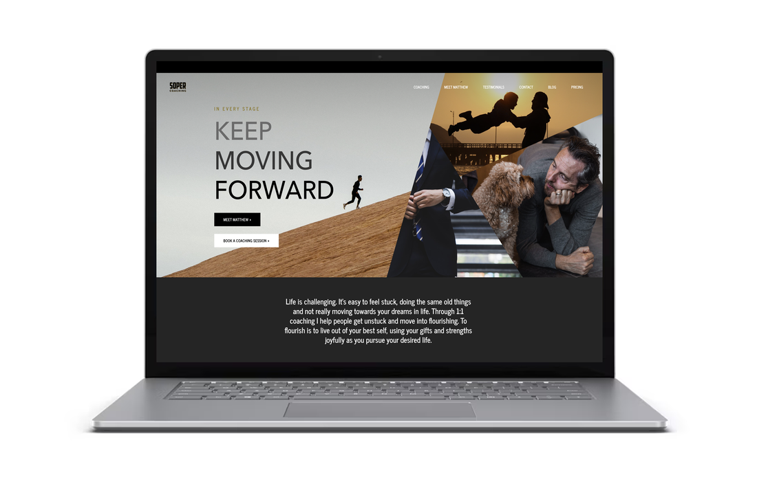
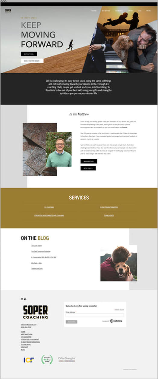
Check out this beautiful home on the web for this Texas-based life coach. I've noticed that many coaches and therapists don't know where to start when they begin offering their services to the world. Is it on socials? Is it an email? Is it a website?
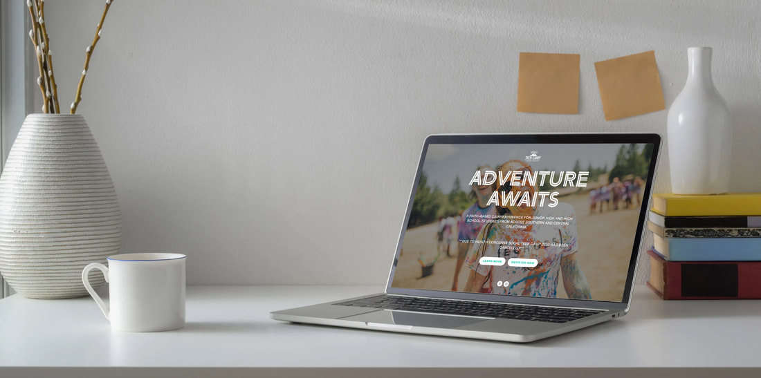
I find that a website is a great place to start for several reasons. 1) Think of a website as you online 24-hour marketing team that tells the world what you do, even while you sleep. 2) Getting words organized on a website is a great way to help you tighten up your branding and marketing message. Specifically articulating what you offer and what problems those products/services solve is an essential stage in developing your business. A website will help you do just that. 3) A website is an advocate. It makes you look like a legit company. Once you have a website, you're not just some guy or gal doing this hustle on the side. You've gone pro, and you're charging for it. Check out Matt Soper's coaching website at sopercoaching.com >> Website designed and built using Weebly. Socal Teen Camp is an awesome Christian summer camp for teens around Southern California that takes place every year in Idyllwild, California. Socal Teen Camp needed a summer camp website designed that communicated information about the logistics of camp, captured camper registrations and payments, and allowed the camp directors to broadcast important information such as packing lists, last minute announcements, and more. Check out this awesome summer camp website in action here >> or scroll down to scope out the home page.
It was so much fun to build this website for Malibu yoga teacher Natalie Backman! Natalie teaches a light-hearted and soulful practice that fluidly evokes the calming effects of the ocean. So what better place to photograph her work than at the world-famous El Matador Beach!
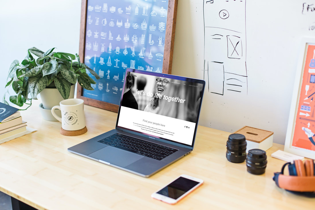
Natalie's website is based on beautiful photos and cheerful pops of yellow to invite website visitors to subscribe to her newsletter, sign up for virtual classes, and learn more about her international yoga retreats. With class descriptions and links to her recorded classes on YouTube, this website connects Natalie's social media presence with her home on the web. Check out the home page in detail below or click here to view the live website and click around between the pages >> It was an honor to develop this beautiful and functional website for one of Malibu's beloved yoga teachers. Namaste Natalie!! ** The website was built using Wix, one of the many browser-based website builders that I use. My philosophy for building websites is that you (the owner) should feel comfortable making updates and simple edits (think text and images) to the website and not need to hire me for every little update need. To that end, every website project I do concludes with a "pass off" meeting during which I screen share with you and show you the nuts and bolts of logging in, posting to your blog (if your website has a blog), and making basic edits. If you're in need of a brand new website or long overdue for some edits to your existing website, shoot me an email and let's talk >> [email protected] The church website for University Church of Christ in Malibu, California was so much fun to build because this community is near and dear to my heart. This church is my home and my community and the crowd of people that I laugh with, live alongside, worship with, gather with, celebrate with, and kick it on the weekends with.
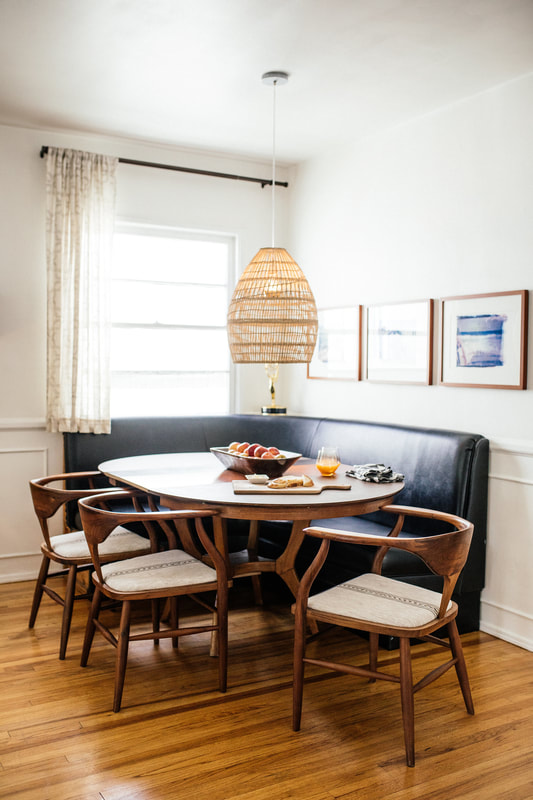
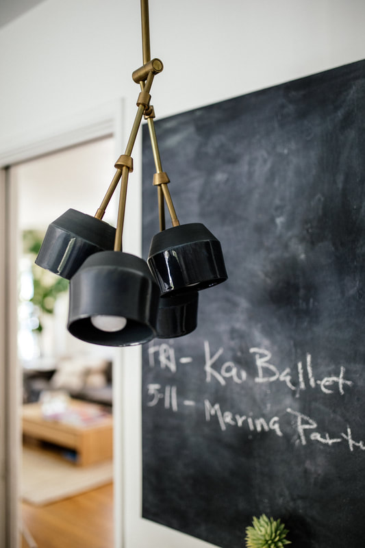
This church website was designed to be a home on the web, showcasing details about University Church's regular meetings, sign ups for small groups, applications for student jobs, and to share a little taste of what it's like to be in community with this awesome church in Malibu, California. Since this has been my church home for the last nine years, I had bunches of beautiful photos to choose from that showcase the authentic feelings and the aesthetic beauty of our community nestled on the coast of southern California. Scroll through the screenshot of the UCC Malibu website home page below, or click over to the live website to see the functions, such as embedded newsletter sign up, recruiting students for student worker staff positions, and even a spiritual life blog that was started by some students on the ministry team. ** This website was built using Weebly, one of the many browser-based website builders I regularly use to design beautiful and useful websites for my clients. All the websites I build are optimized for desktop and mobile browsing, and part of the website package is a final meeting with me where I hand over the keys and show you how to login and make changes to your website, such as updating photos and changing text. I believe that your business should have a website that you love AND that you're able to edit AND it shouldn't break the bank. If you're looking for a brand new website or updates to an existing website, shoot me an email and let's talk >> [email protected] I tend to shoot mostly people, so when I got the chance to snap photos of objects in a home, it was totally different and a little harder but also a little easier! Kristen O'Malley is a space designer. She does homes, sets (check out her Emmy in the gallery!) and more. Her taste is incredible and every piece has meaning as well as beauty and a great story. What a treat to photograph the work of a fellow creative!
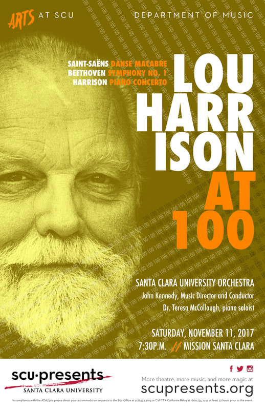
One of my favorite clients is SCU•Presents, the performing arts center at Santa Clara University. The key to filling seats in their performing arts venues is to have great marketing, and the key to great marketing is the spiffy posters I make for each music, theatre, and dance production.
I work closely with the SCU•Presents marketing manager to create each poster, based on a design brief. Once each poster is finalized, it is used in digital and promotional print efforts, from posters to postcards, email and social media blasts. Below is a sampling of the posters I created for SCU•Presents in 2017. When the Honey & Oak team reached out to me with a concept for an online boutique that changes product & theme every month, I was hooked. Their concept is simple and elegant: a limited selection of one-of-a-kind handmade or found (curated) items. Each collection is cohesive and fits the overall theme, which changes seasonally. Take a look at Honey & Oak's home page now... you never know what you might find!
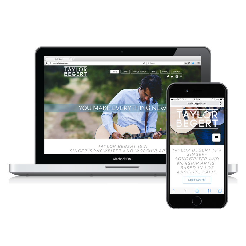
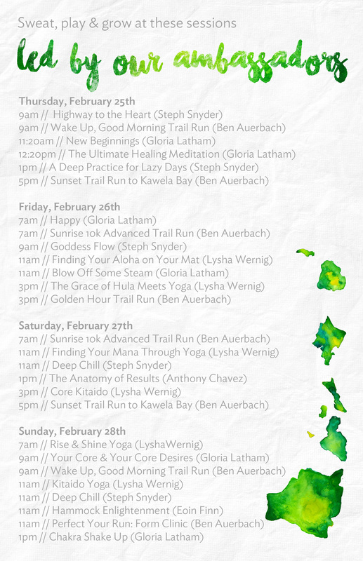
The site also features live feeds from each of Taylor's social media accounts, and a media page packed with easy downloadables. Lauren then went on to print business cards with the new website url, and wrap them up as a stocking stuffer for Taylor to open on Christmas Eve. I'd say Lauren gets the wife of the year award. Like all websites I build, this site is responsive (meaning it resizes and reformats when the browser window is resized for a narrow screen). Photography credit: Safeena Padder Got to design a fun little set of invitations and post cards for lululemon athletica, one of my all time favorite clients! These pieces will accompany a swag bag, filled with all the necessities for getting the most out of Wanderlust Oahu, compliments of lululemon. I used lululemon's custom island illustration asset that will be printed on shirts and show up throughout their festival collateral and tied it all together with the company's brand fonts & style, with a little flair. (above) front & back images of a 4x6 post card invitation
(below) front & back images of a half page (8.5 x 5.5) schedule |
I'm CecilyLA ★ ATX Categories
All
Archives
July 2024
|
LOCAL WEDDING & PORTRAIT (AND MORE!) PHOTOGRAPHER IN MALIBU, CALIFORNIA + AUSTIN, TEXAS ★ WEBSITE AND DESIGN SERVICES FOR SMALL BUSINESSES AND ENTREPRENEURS AROUND THE WORLD
|
I BUILT THIS WEBSITE MYSELF USING WEEBLY • © 2011-2024
|










 RSS Feed

